Tuesday, March 15, 2011

Outdoor Lighting

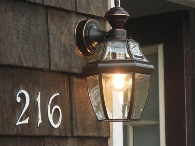
You may remember from this post that we replaced this light: 


with this one:


That wasn't the end of our outdoor lighting story. Our house had two broken lantern-like lights on poles.  You can just see one poking in on the right side of this picture:

The other one hidden up by the barn.  You can just barely see it in this picture.  It's just to the right of the thickest tree (almost parallel to the red pole sticking up from the plow of the truck):

We also have a wall sconce in the same black iron and yellow glass style in our sunroom next to our backdoor.  Though ill-placed and less than appealing to look at, all of the lights are in okay structural shape and with a little re-wiring, they provide much needed light for our dark yard.  I started brainstorming economical ways to transform the lights until we can move and/or replace them with a better style.
While wandering through my local Ace Hardware, I found sheets of Plexiglass for $5 a sheet.  I took it as a sign that I was meant to immediately start on the outdoor lights.  So, while at Ace, I also picked up an extra large can of Krylon Outdoor Copper spray paint.

Armed with my tools, I got to work.  I replaced the old, yellow glass with textured plexiglass.  Here's a before and after of the fixture near the front of the house:

To cut the plexiglass, I laid the sheet of plexiglass onto some old wood that I used as a home repair cutting board.  I laid one of the glass panels on the sheet of plexiglass.  Using a utility knife, I traced the outline of the glass piece onto the plexiglass, scoring the plexiglass about halfway through.  I then very carefully folded the plexiglass until it broke into a clean line in the shape that I had scored into the plexiglass. 

Once all of my pieces were cut, I replaced them in the light fixture.  I love it.  No more crazy yellow color.  And, I can use the energy saving compact fluorescent lightbulbs (CFL).  Before I changed the glass out for plexiglass, I didn't like that you could see the swirly shape of the lightbulb (I still used 'em, just begrudgingly).  Not a problem now!

Here is the before and after of the light in the sunroom next to our backdoor (the top was removed for spray painting):

By the end of the week, the weather should be warm enough to spray paint the rest of the fixtures. 

Friday, March 04, 2011

Buttons!

I have been meaning to make new throw pillows for our couch and bed for a few months now.  Everytime I head to the fabric store for a costume or some other sewing project, I check out the remnants room and usually find something that I love (good thing I have lots of storage in my sewing room!).  I have also been obtaining pillow forms for some time now with grand plans to sprinkle throw pillows all over the house.
One important thing to note with every throw pillow I make, I put a zipper down one side so it is completely removable and every supply that I use is machine washable.  This means that I can change out the covers as I get bored and wash them as they get dirty.


The first pillow that I am working on is the most labor intensive by far.  I saw this image on crafting a greener world: 

It was over.  I was sold, I swooned.  I became obsessed with googling pictures of button monogrammed throw pillows.  On my button pillow, I wanted to do a 3 (to represent the members of our family: Matt, myself, and the pup).  This pillow was made out of white buttons and some leftover white linen dyed a dark blue-ish gray.  Note:  I am still thinking about making a 4 pillow if and when we have a kiddo. 

The cost for this throw pillow was minimal.  I already had the fabric (leftover from the roman shades I am making for the front room), I had the dye (but it only runs about $2 a box at JoAnns if you want to try this project yourself), I already had the thread, I already had all of the white buttons (I've been sewing for a long time and had collected a few small containers full of buttons over the years.).  The pillow forms I have were each less than $5 (I get my pillow forms from Hancock fabrics or JoAnn fabrics if they're having a sale, or from Atlanta Thread Company if I'm making a large-ish purchase and can justify paying for shipping).  The fabric paint was $1.19 at Michaels.  For the 3, I used Elephant font, bolded.


After I printed out the number, I traced it onto the cleaned and dried gray dyed linen.  With the text traced on the pillows, I used white fabric paint to fill in the number a little bit.  I did this only so that if I did leave any gaps or a button falls off in the future, it'll still look okay until I notice and fix it.  Here is my 3 traced on and painted very lightly with iridescent white fabric paint:


Then, I laid out my buttons and just started sewing. 


I'm still sewing on buttons, but when it's done, I just have to sew on the back, put the zipper on, and put it on the pillow form.  I'll update with pictures when it's all done.

Tuesday, March 01, 2011

I am a spray paint addict

I firmly believe in the power of spray paint.  When we moved in, we had a lot of things that were still functional, but not incredibly pretty.  Some things that we had from our renting days or that came with the house (like the mailbox), were perfectly fine, I was just unhappy with the color.  I constantly have a mental list of items in our house that I would like to freshen up with some spray paint. 

A few weeks ago, while on a Lowe's trip, I picked up a few cans of white glossy spray paint and spray primer.  I just got around to gathering everything that I wanted to paint, prepping it, and getting the jobs done. 


Project 1:
Picture Frames
I got a dozen 11x14 picture frames at Michael's for $1.50 each a couple of months ago (on sale, plus a coupon!).  Michael's only had the frames in black.  But, they are very sturdy plastic that came with a mat and quality mounting hardware. I used one coat of white spray primer that is made for plastics and two light coats of spray paint to get these from black to white.  The mats were white when I bought the frames.  I took them out of the frames and spray painted them with metallic silver paint.  I have to say, I'm pretty thrilled with the end result, especially for the price.  Here's an idea of what the frames looked like before:

And the after:


Project 2:
Firewood Holder
Fine shape, great price, wrong color.  Matt and I picked this little baby up at Menards for just over $10.  I didn't actually remember to take a before picture of this piece, but here's the after (just imagine it in black for the before)  


Project 3:
Garbage Can
We bought a couple of these garbage cans at Target way back in college.  They were cheap and could hold garbage.  And, at the time we bought them, that is all we were looking for.  These days, they were looking a little bit rusted and gross.  After a quick once-over with some sandpaper, I was ready to spray prime and spray paint.  The garbage can is still as functional and cheap as it's always been, but now it matches my color scheme and looks clean
Before and After:
Much nicer looking, no?  And here it is in our bedroom (it's right under the calla lily picture from my this post)
Project 4:
Mirrors
Matt got these mirrors from one of his tenants.  They were planning on throwing them away.  I am always on the lookout for big mirrors.  I love how much a mirror can open up a space and reflect so much light back into a room.  Matt snagged these before they met their fate in the dumpster.  I cleaned them up and primed and painted them white.  I think it's a big improvement from the icky, dated gold color.  Here's the before, during, and after:


Project 5:
Thread Rack
I ordered two of these unfinished wood thread racks off of Amazon for my sewing room:
They're functional and hold a ton of thread.  But, they were kind of blah.  Two coats of Valspar Glossy Tulip Pink spray paint later and they are a cute little punch of color in my sewing room:


Next on my spray paint itinerary:  A few of the planters that live in our sunporch, some pieces of trim to finish out a mirror in our guest bathroom, an old light fixture on the sunporch, a recycling bin for our kitchen, and some more picture frames.

Thursday, February 24, 2011

Stuff on the walls - Part II

A couple of months ago, Matt found this sweet Typographic Map of Chicago on zazzle.com for a mere $30.  And, it's HUGE!  It's just shy of measuring in a 2 ft x 3 ft.  We thought it was super interesting. 
The map has been sitting rolled up in a corner of our kitchen for a couple of months while we argued about discussed where to hang it and how to frame it.  Last week, Michaels was having a 60% custom framing sale and we were totally inspired by the rest of our new wall decor, so loaded up our map and headed over there.  I was so amped to get this thing framed that I started taking pictures as we were walking into Michaels!
 

About 30 minutes later, we had selected a pretty, simple white wood frame and a gray/green/blue mat.  The picture below doesn't really capture the color of the mat accurately, but I only had my phone on me.

I'll update with pictures in two weeks when it's all done and back in our home.

Monday, February 21, 2011

Stuff on the walls!

Well, it's official, after 14 months in our home, we have started putting things on the walls.  It was a big step for us. 

Between removing the popcorn ceilings, adding so, so much drywall, painting, and trimwork, we didn't want to hang anything on our walls.  We knew that if we put anything up before the walls were done, we would constantly be taking whatever art we hung up down so it would not get damaged while we worked. 


We started in the bedroom.  Matt and I bought this print from IKEA a few years ago on sale for less than 20 bucks.  I love how crisp it looks next to the Sporty Blue of the walls.  We're still tossing around ideas for what to put on the other side of the window, but it's really nice to have a little something in there.


With the bedroom looking spiffy, we turned our attention to the kitchen.  Our kitchen has two wood walls and a few drywalled walls.  As we're planning on gutting the whole room in the not too distant future, we really haven't done a ton in the kitchen in terms or renovations or decorating.  Sure, we removed the popcorn ceiling, painted the ceiling, changed the light fixture, replaced the handles and knobs on the cabinets and drawers, and busted down a wall; but it's not like any major changes have gone down.  We haven't even painted the walls yet (though color selection is underway). 

Since the walls haven't been painted yet, and we knew what we wanted to adorn one of the wood walls, we started there.  For Christmas, Matt's mom gave us a vibrant, framed needlepoint that she made for us.  It's stunningly beautiful.  Here's her signature on the bottom and a close up of the matting used to frame it. 

And a view of the whole piece.  We're just thrilled with it and it fits perfectly into our vision of the kitchen.  I am so impressed with her needlepoint skills.  Thanks, Sue!

With the needlepoint in place, we were ready to move onto the other side of the china cabinet (which is never moving again because it is freaking heavy!). 

Matt and I honeymooned in Sonoma County, CA.  We have since returned for the harvest festival and hope to head back later this year.  Every time we go, I take more and more pictures of the beautiful scenery of wine country.  We opted to use some of these pictures to decorate the kitchen.  I also had a handful of plain metal frames that I got back in college just sitting in a box in the basement.  We pulled those out and cleaned them up and framed our four favorite wine country pictures.  That was the easy part.  The hard part was picture placement.  Using paper that is the same size as the frames, we created dozens of arrangements.  Here are a couple of our top contenders: 

In the end, we went with a more spaced out version of the second arrangement.  Here's the finished (though no centered in the picture) wall:

And, a close up of the pictures we chose:


I love how having a few pieces of art on the walls makes our house feel so much more like home.  Now, onto all of those walls in the living room....

Monday, January 03, 2011

Guest Bedroom Walls

There are two rooms in our house that have remained untouched since we moved in.  Both are small bedrooms that we have been planning on using for future children.  Until last week, both rooms were used for storage and the doors were kept closed pretty much all of the time. 

So, we decided to use some paint that we got during a major sale at Sherwin Williams, our old mattress (A few months ago, Matt and I got a new mattress.  It has individually pocketed springs and a very thick layer of memory/tempurpedic foam on top.  It's fantastic.  It did however leave us with an older mattress that wasn't quite ready for the garbage.), some art we used to have hanging on the walls of our rental, and a hand-me-down nightstand from my grandma to make a sort of guest bedroom.  I don't plan to drop a lot of money on this room as it won't be used very often and we have plenty of furnishings and accessories that can be repurposed into that room. 

Here is what the "guest bedroom" looked like before I got my hands on it: 

Awesome, right?!?  The first thing I did was remove that crazy fabric from the window.  Then, I got to work on the wallpaper.  Luckily, only one wall was wallpapered (though all of the walls have a border).  Here's what it looked like close up:  


But, as I started to scrape off the old ugly, crazy wallpaper, I found......

Different old, ugly, crazy wallpaper!!!!

It's very pink with these women gardening or just hanging out in a garden.  It's a little tough to figure it out, exactly.  I'm pretty sure it's original to the house (built in the 70s), as the only thing under the bottom wallpaper is the drywall. 

My favorite part of the wallpaper is that each of the girls has a different word on the pockets of her dress; Fun, Love, Joy, Happy.  It's very, very 1970s.  And I kind of love it.

Here are some close-ups: 

Thursday, December 23, 2010

Our Mailbox

When we bought our house, the main entrance was a boring, sad sight: our mailbox was black and rusty, the light was too small for the house (and did not provide enough light), the landscaping left a lot to be desired, moss was growing on the roofs of the barn and the garage, and the gravel was literally coming up off of the driveway.  In a nutshell, our poor outdoor living spaces had been seriously neglected.  We have been gradually improving our yards, but we still have a long road ahead of us.  This summer we devoted quite a bit of time into growing some grass.  We have about doubled the amount of grass that existed at our house when we moved in.  We replaced the light fixtures on the front and the side of the house.  And we have started saving to repave or replace the driveway.


One thing that has bothered me about our house since we moved in was our mailbox.  When we started working on updating the outside of our house, we decided that most of the finishes out there should be copper.  We felt that it would look nice with the overall look of our house and would age well in our area.  The copper mailbox that I have been eyeing was a little out of the budget right now, plus our old one still works perfectly fine (although it's a little rusty).  Still, I felt the itch to spruce up our main entrance a little and turned my attention to the mailbox.  Here's the before:


I am a spray paint junkie.  I'll admit it.  If I don't like something in our house, my first instinct is to spray paint it until I can replace it.  Knowing that I didn't want to fully replace the mailbox right now, but that I did need a change, I ran out and picked up some Rustoleum copper spray paint (that I actually have been planning on using on some old plastic planters in our sun room) for about 7 bucks.  One Sunday (no mail delivery), I took the mailbox off of the house, scuffed it up with sandpaper and applied several extra-light coats of spray paint.  Here it is all scuffed up and ready for the painting: 


I'm thrilled with how it turned out.  My spray paint rampage will continue now that I have had some success with the copper spraypaint.  Here's the finished project:

Thursday, November 18, 2010

Fall Decor

Having never owned a house before, Matt and I had never really gone all out decorating for the different seasons. So, we decided to take a bit of a break from major renovations and get in the spirit of the season by putting up some fall decor.

I didn't bother taking pictures of some of the little things we did around the house like changing out our white candles for butterscotch colored, "harvest" scented candles on our mantle. Our switching out our white candle in our kitchen for an apple scented jar candle.

Some of the larger projects we tried included making a wreath for the door to our mother-in-law room off of our main entrance hallway and setting up a cute little fall area outside our side door (and main entrance of our house). I'm super happy with how both turned out. The original brainstorming resulted in trying to come up with projects that we could put out (at least partially) in September and, with a few modifications along the way, could last us through November.

The first thing I made was the wreath. For a grand total of $15 (everything either on sale or 40% off couponed at Michaels), I picked up the following items:
A ready-made, grapevine wreath
Two packages of burgundy/orange/green berries (on the left side of the above picture)
Two packages of burgundy, orange, and clearish, crystal berries (I intended to use these sporadically throughout the wreath, but after I got the first set on, decided I loved the wreath as it was and didn't end up using them. I still like them though, so I kept them for use in some future project some day.)
1 yard of ribbon
I already had the thread.

I started by laying down the wreath and unwinding my berries. Then, I just started covering the wreath with the berries and tying it off with thread periodically to make sure nothing moved. You can see that some berries fell off the wire as I attached it, I just cut my losses on those and kept going. The wreath looked great without the berries that fell off, so I wasn't too stressed about it.

Here's a close-up shot of the wreath when I was about halfway done:

When everything was done, I tied the ribbon in a bow and Matt patiently held it in various spots around the house while I decided where it would ultimately live. Here's Matt holding it up to the front door:

I finally decided that I liked it on the door of the mother-in-law room. And here's my finished fall wreath hanging in it's final spot:

With my wreath in place, I turned my attention outside. Since we went from college life to apartment living, we had never had trick or treaters. I wanted to set up an area by our side door that looked a little festive. I did not want to devote a ton of time or money to this project, and I wanted it to last all season.

I stopped by a local garden supply store near our house and picked up the following items (along with some bundles of firewood, the grand total came to just under 40 bucks):
3 hay bales
2 mums (one yellow plant and one burgundy plant)
2 corn stalks

On the same trip to Michaels that I picked up the supplies for the wreath, I also picked up:
1 large Funkin (fake, carvable pumpkins)
1 small Funkin
1 small can of Chalkboard spraypaint

I set the haybales up on the edge of our deck next to our door. I used some planters that I had used for now-dead plants over the summer and planted the mums. Matt and I headed to Bengston Pumpkin Farm one day and picked up two very large pumpkins, one medium-sized pie pumpkin, two small pie pumpkins, several mini-pumpkins, several gourds, one medium-sized white pumpkin, and one medium-sized green and white pumpkin.

With all of my supplies acquired, I set to work!

I used the chalkboard spraypaint and completely covered each of the Funkins. I then used some orange chalk that we keep around for when our nephews and/or cousins visit to draw jack-o-lantern faces and write Halloween themed messages on the chalkboard funkins. I arranged the Funkins along with the mums, other pumpkins, and several gourds on the haybales for this finished product:

This arangement was re-arranged about a million times prior taking it down, but this was one option that was up for a short time. At this point, I had "Happy Halloween" and "Boo" written on the chalkboard Funkins. And just for fun, here's a night shot:

So, that wraps up our fall decor. Hopefully, it will be a little more elaborate next year. But, I'm pretty happy with the outcome of this year's decor. What do you think?

Thursday, October 07, 2010

Painting the Sunroom

Like I said in my previous post, our Sunroom was sad before we got our hands on it. While the weather was nice this summer, we decided to hit it hard and make some big improvements out there. After the new concrete floor was poured, we decided to start painting the walls. The walls of the were just plain old wood panelling. We only have screens in the windows out there now, but at some point, we plan to invest in some kind of glass or fiberglass panels to put up in the winter.
The plan included painting the wood panelling a light cream color (Sherwin Williams color matched a photo we found online into their Harmony-Exterior brand of paint.). This panelling is on three walls of the room (the fourth wall has the same cedar shakes that are on the rest of the exterior of the house). The same panelling is above and below the windows. All of that is the light cream color. The window frames and any other trim in the room is bright white. In the works for next year is replacing the three (currently dark, dark brown) storm doors with white storm doors. The window sill is not being addressed this year. Next year, we will be replacing it with a slightly larger sill that will be stained with some of the leftover stain we used for our hardwood floors (see them again here!). The sill will have a high gloss poly applied after the staining is done.
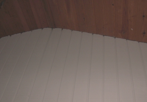
Here is a color of part of the wall after it was painted.  In person, the color is a little more of a cream than it looks in this picture.  And in the room, the off-whiteness of the color is further emphasized because it's right up next to stark white trim.